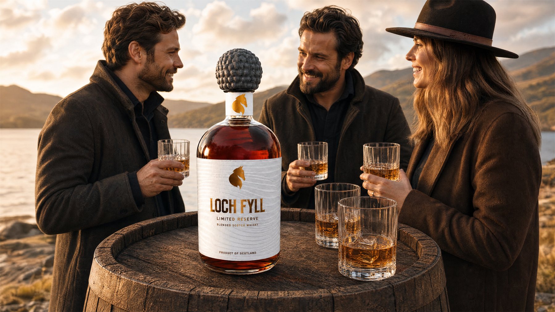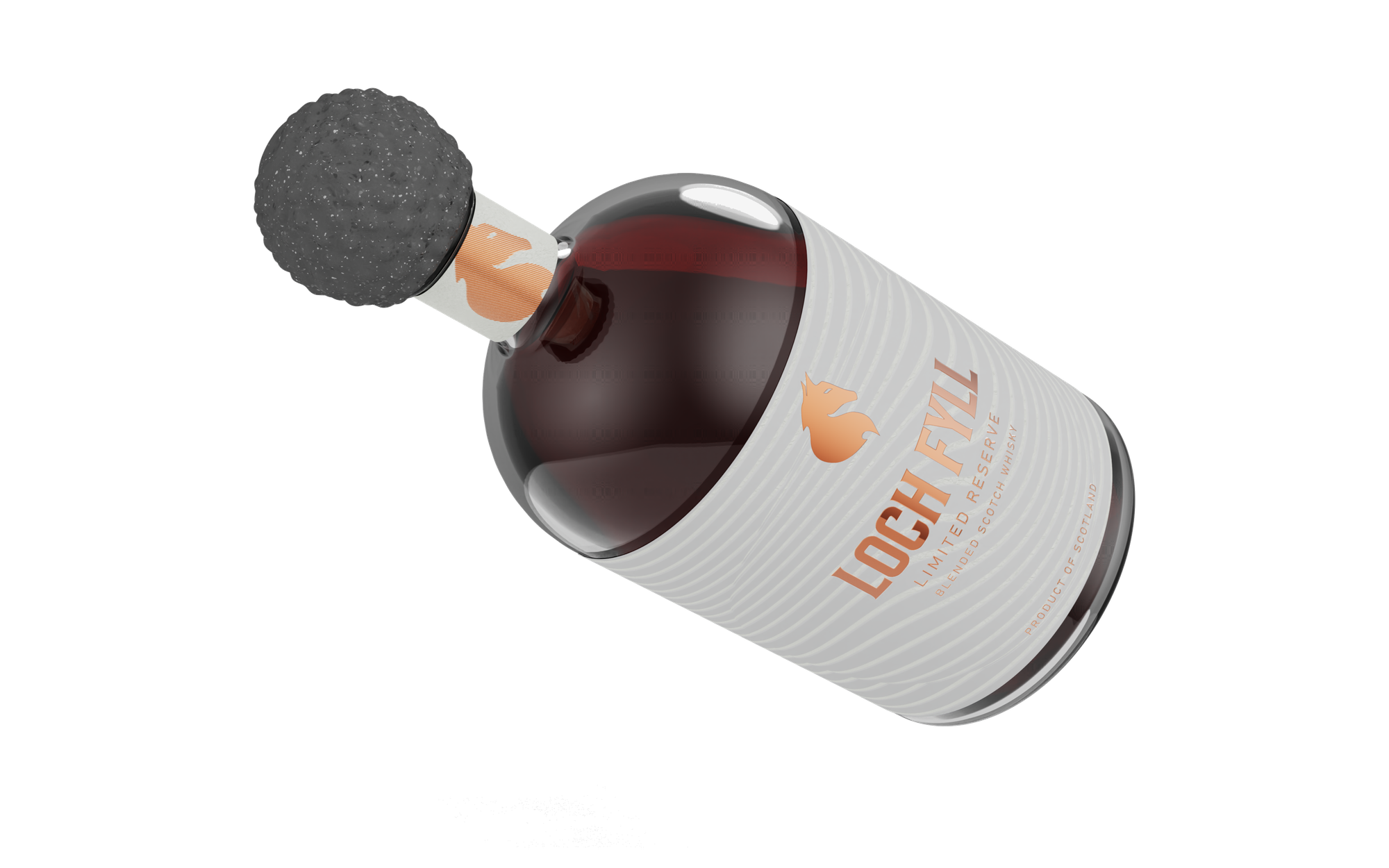
A complete rebrand of a blended Scotch whisky — bottle, closure, identity, label system, prototypes and website. The closure is a carved stone sphere, drawn from Neolithic artefacts found in the Scottish isles.
Loch Fyll came in with an existing bottle and an existing brand, and a straightforward problem: neither said anything. The pack read as generic supermarket blend in a category where the bottle is doing most of the selling, long before anyone tastes what's inside.
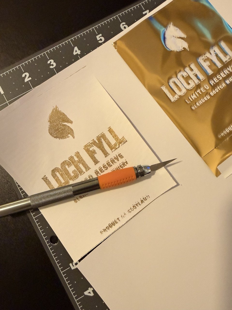
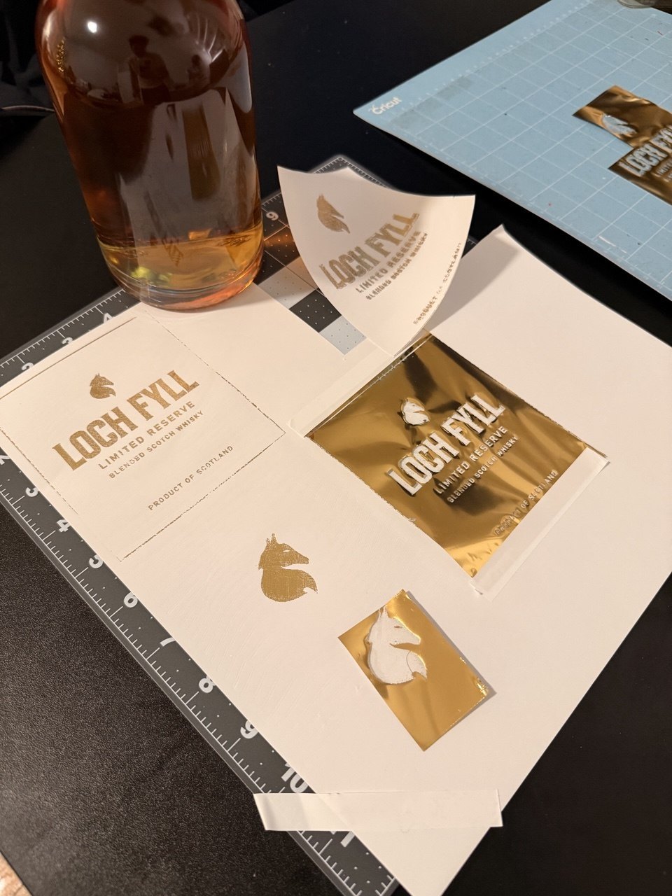
The engagement was end-to-end and unusually complete — brand identity from scratch, bottle and closure design, the full label system, physical prototypes made in-house, and the brand's website. Every decision on the shelf and on screen came out of the same work.
Disciplines
Study
The category runs on the same small set of signals — crest, serif, tartan, a distillery drawing, a claimed year. They are legible, and they are interchangeable. A shelf of them cancels out, because nothing on any single bottle is actually specific to the place it came from.
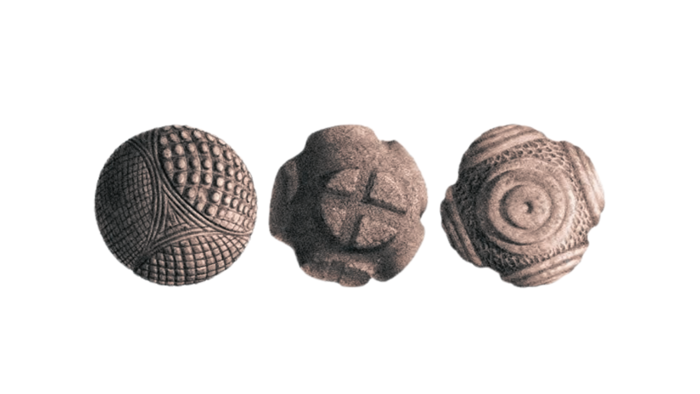
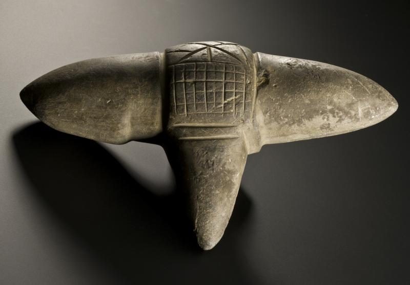
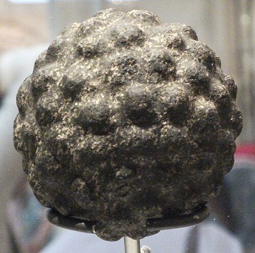
So the search was for something with a real claim to Scotland and no presence in the category at all. It ended on the carved stone balls — Neolithic objects found across the Scottish isles, five thousand years old, their purpose still unknown. Hand-carved, spherical, covered in geometric relief. Genuinely of the place, and used by nobody.
Strategy
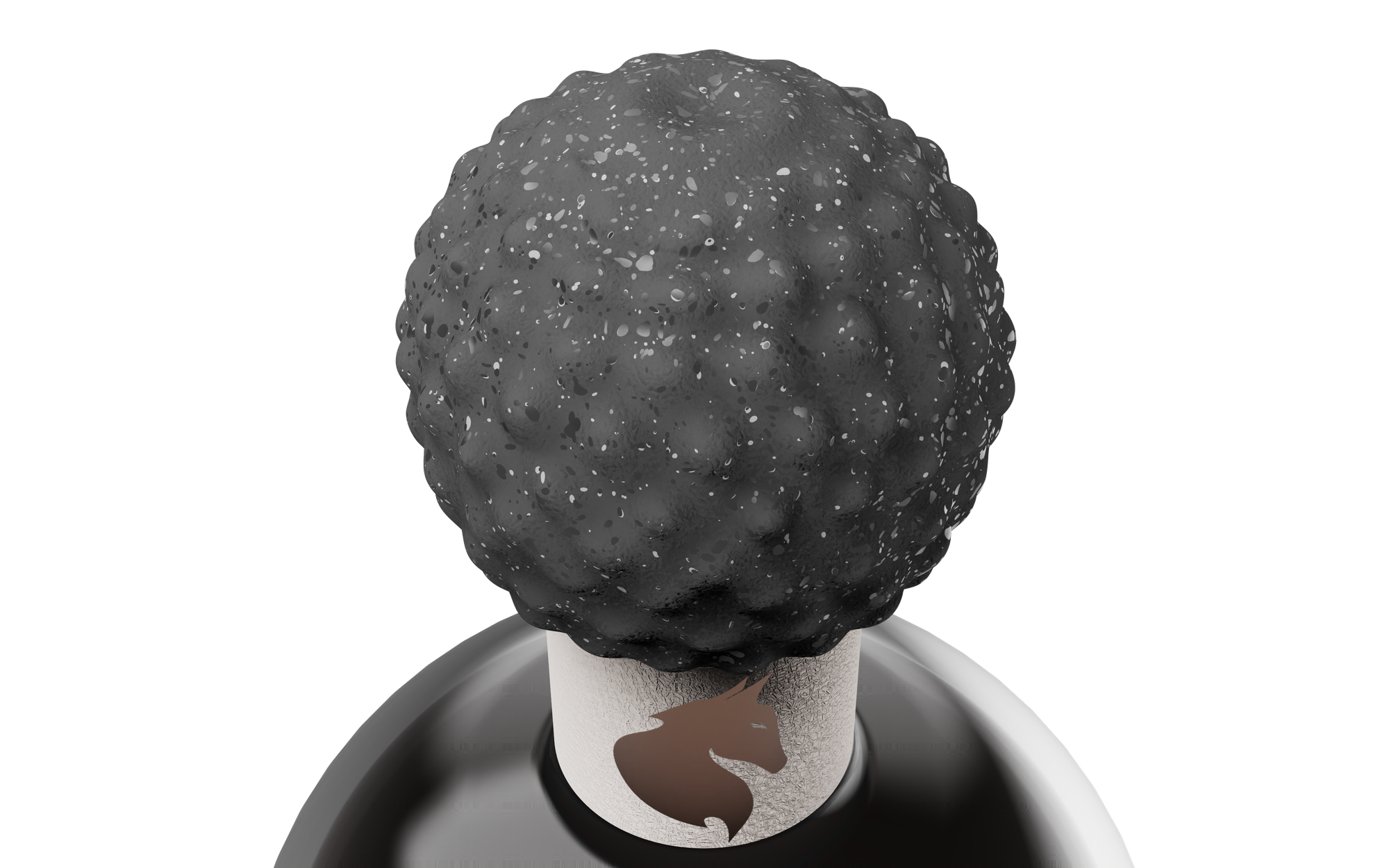
The closure became the whole idea. A stone-textured sphere sitting where a standard cap would be — the one part of the bottle a person actually holds, and the one part that no competitor can copy without copying the reference. Nineteen surface treatments were modelled and rendered before settling on the carve, each testing a different relief pattern against how it reads at arm's length and how it feels in the hand.
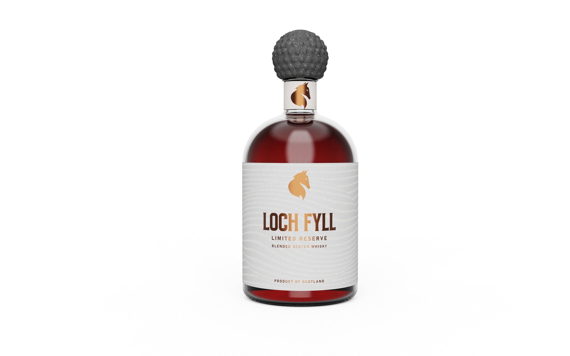
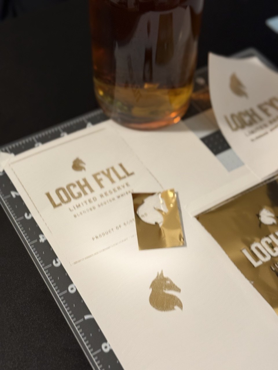
Everything else was built to defer to it. The bottle takes a domed shoulder and a plain cylindrical body. The label wraps in fine topographic contours — a loch read as elevation lines — printed so the ribbing catches light rather than shouting. Copper foil carries the wordmark and a single animal mark. No crest, no tartan, no invented year.
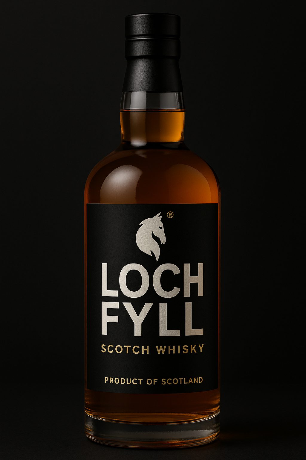
Before + after
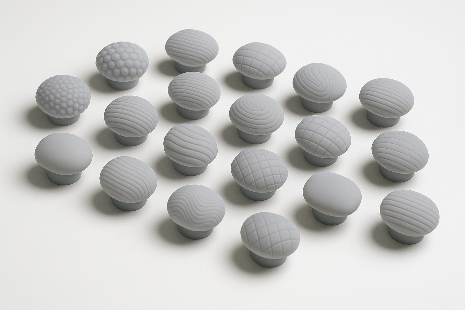
Closure carve — 19 treatments
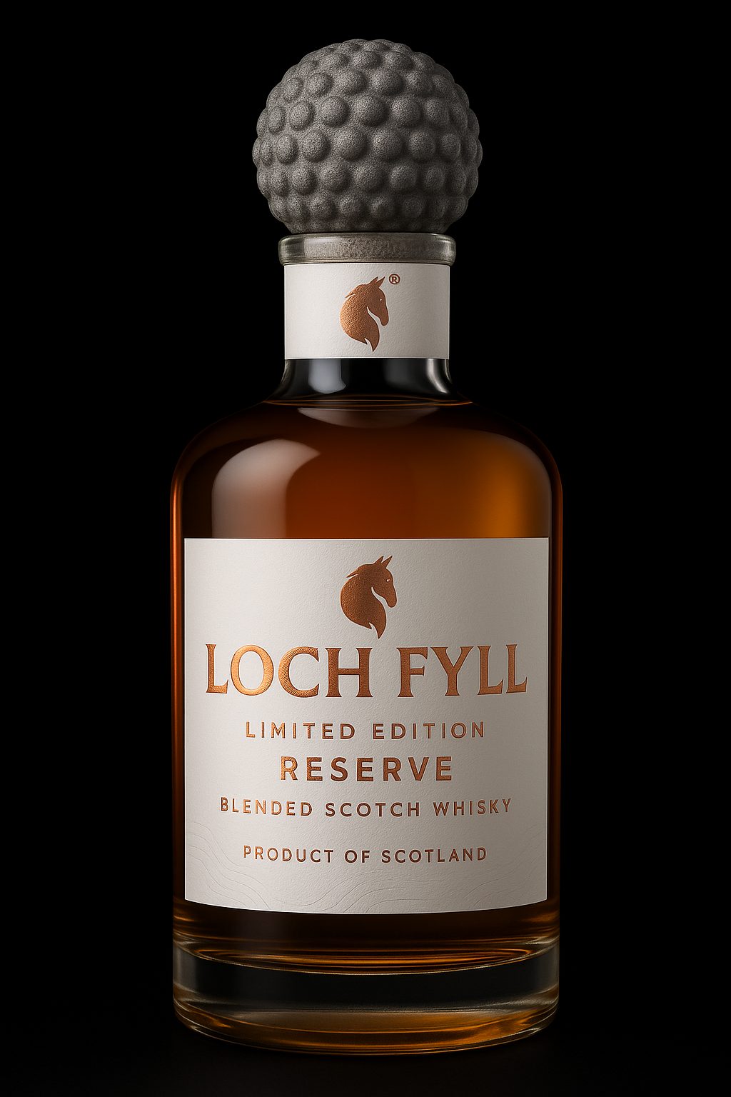
Bottle form study
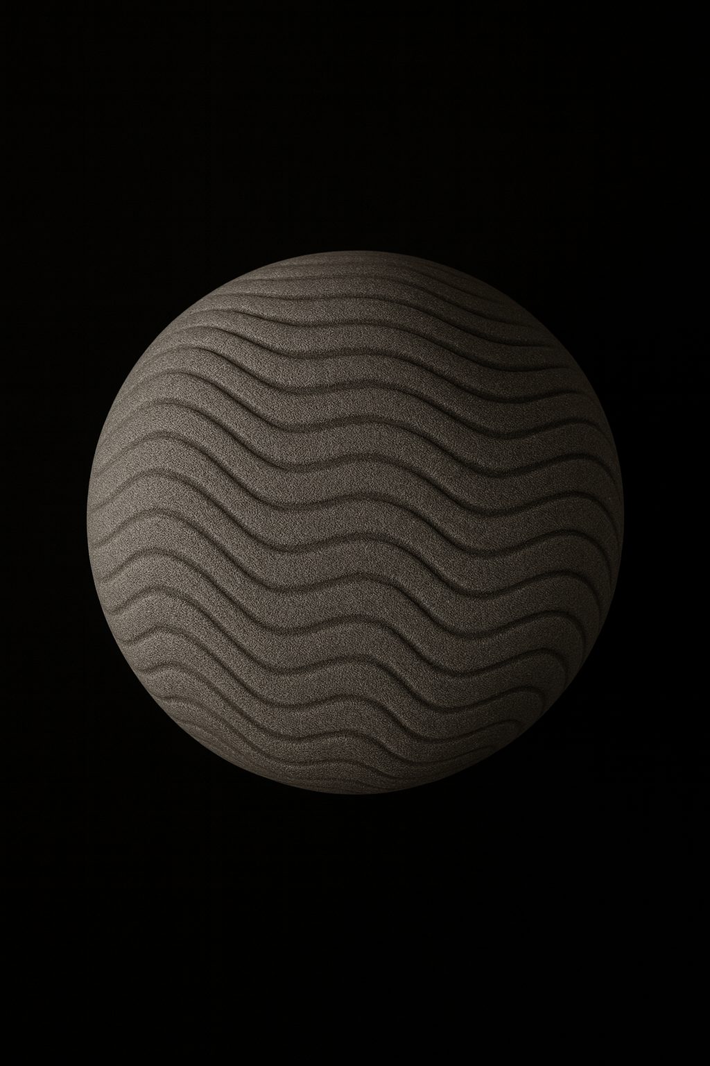
Closure carve
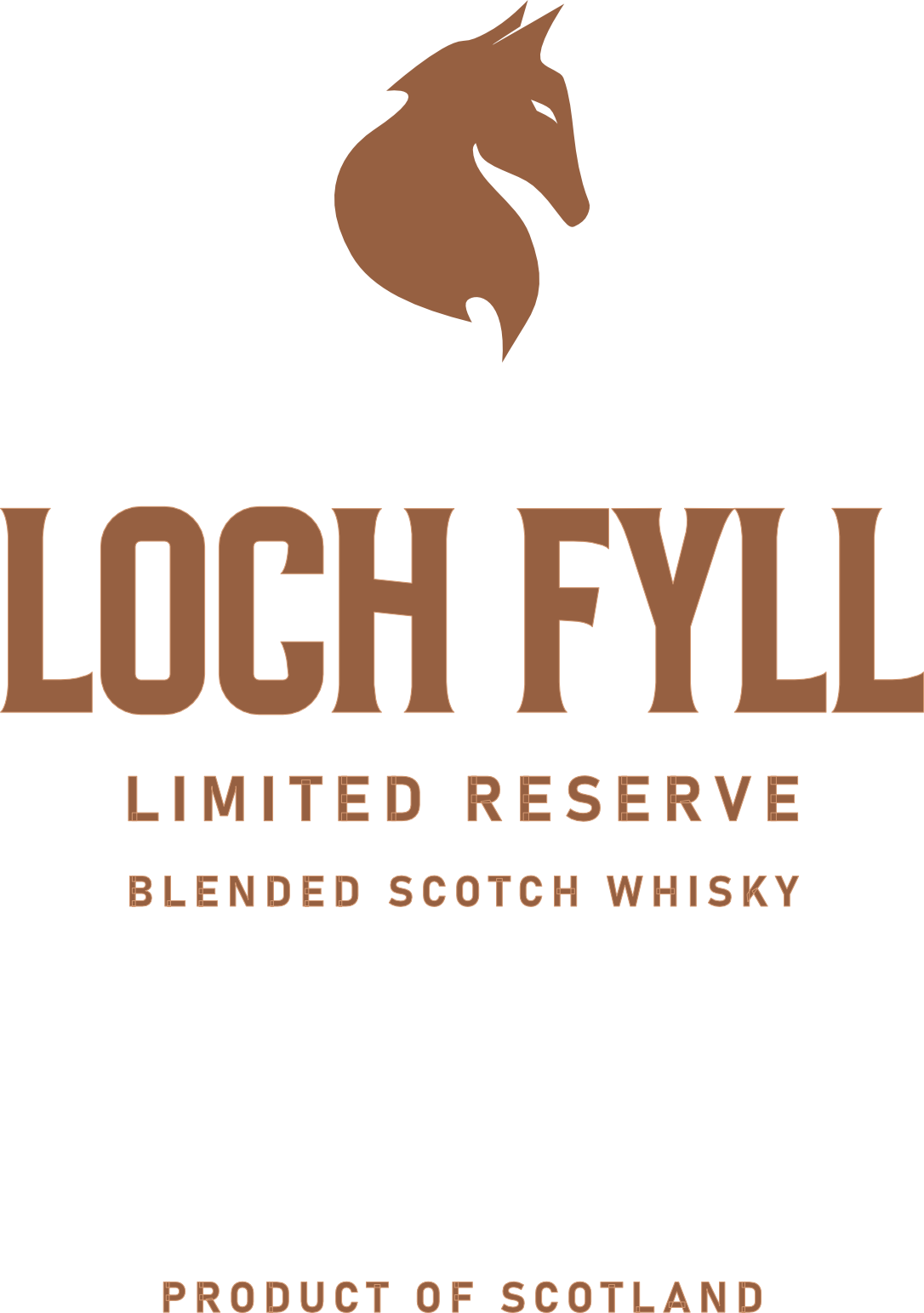
Label system

Label artwork
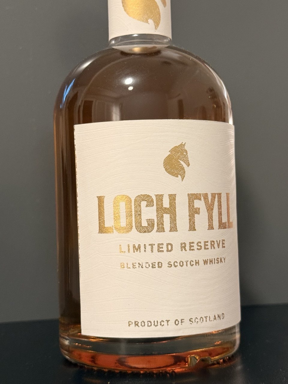
Prototype build — 01
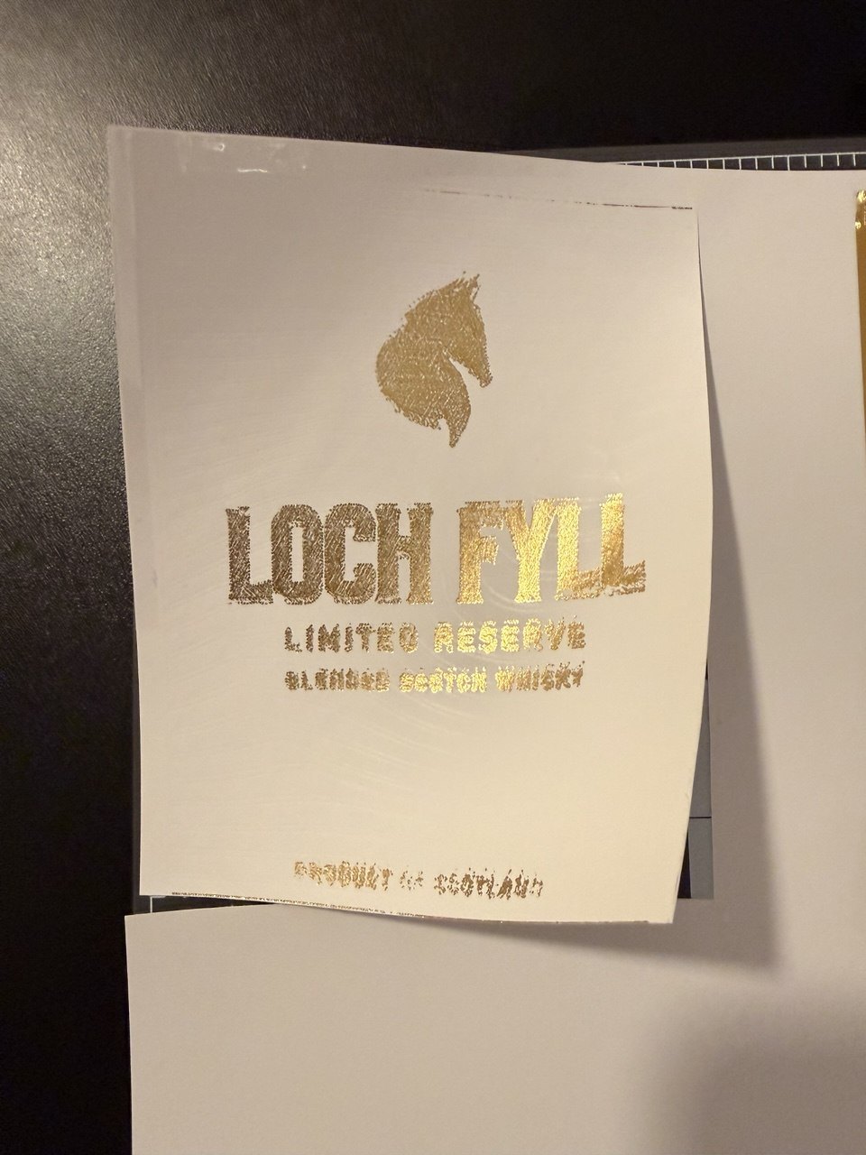
Prototype build — 02
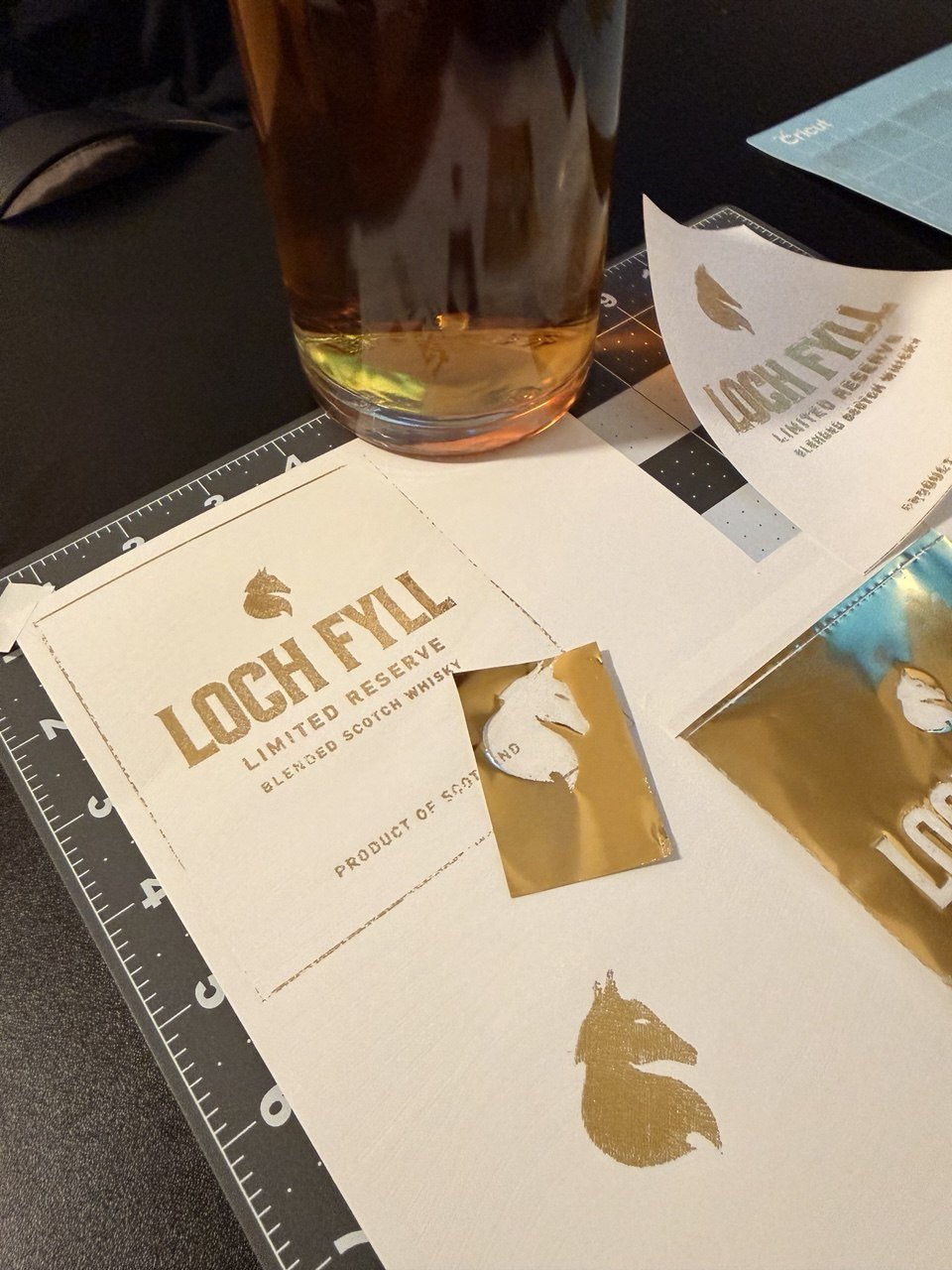
Prototype build — 03
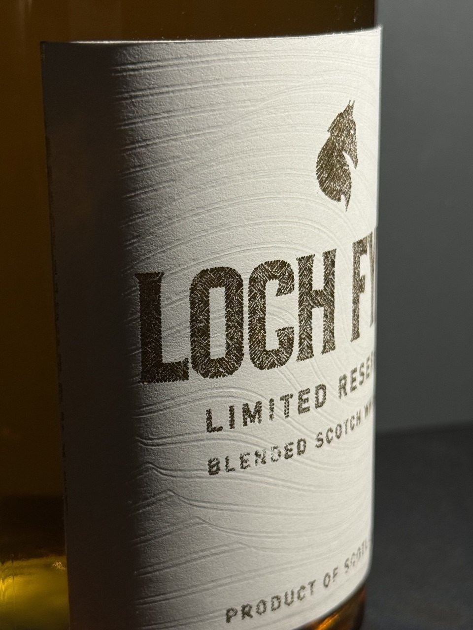
Prototype build — 04
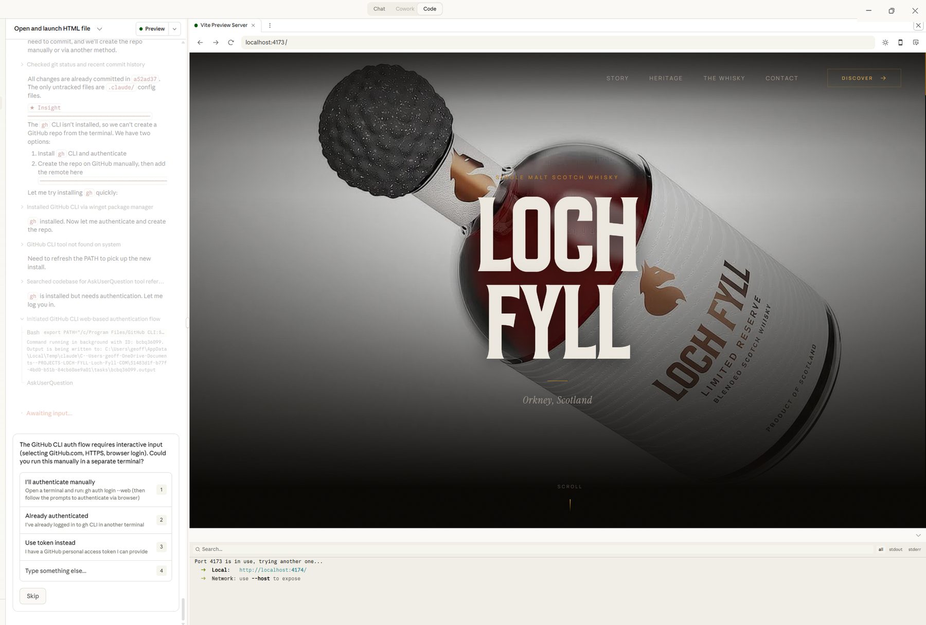
Assembled proof
Result
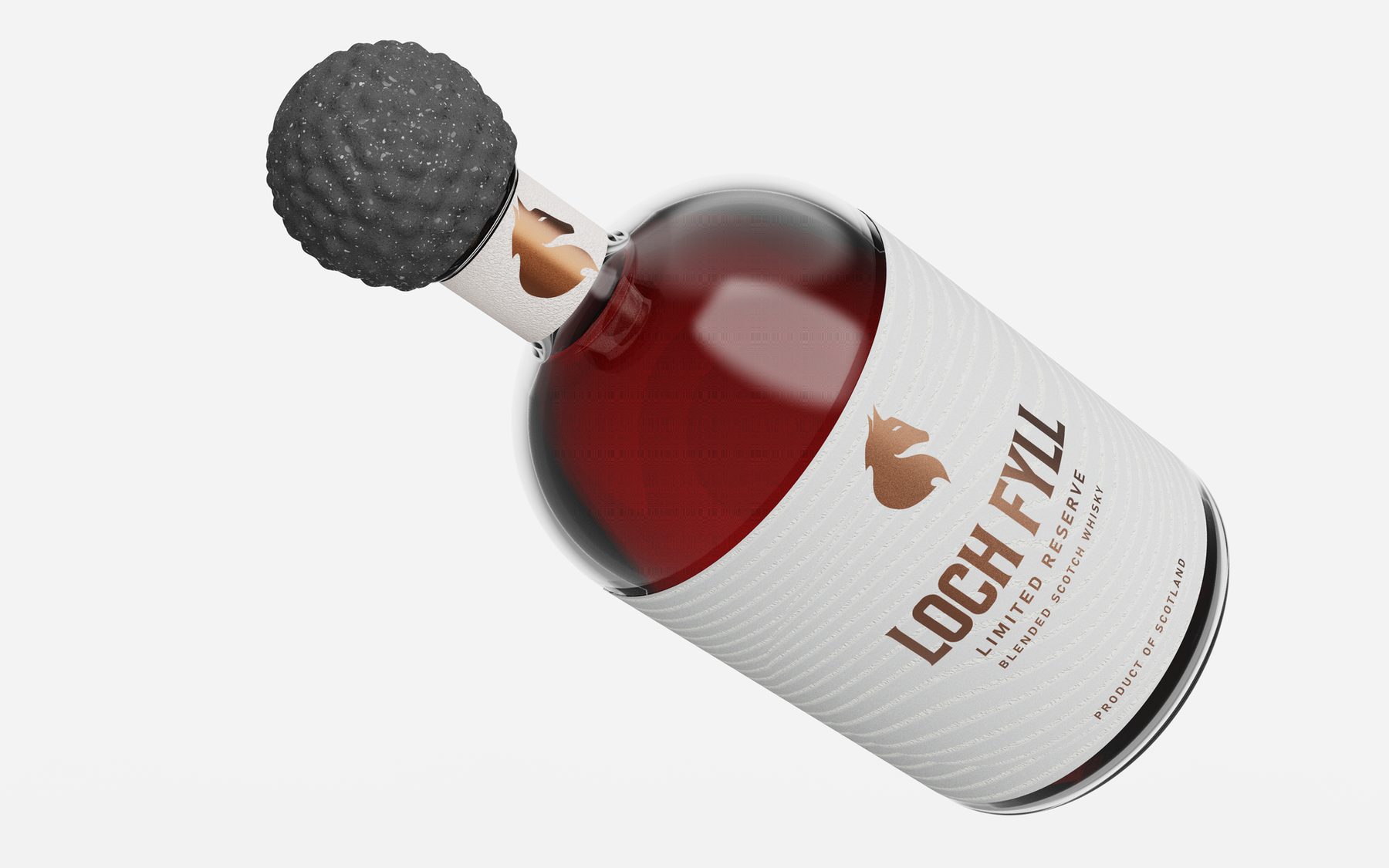
The finished pack leads with the closure — a carved stone sphere that has no equivalent on the shelf and a reference that is genuinely Scottish rather than borrowed. Beneath it, a domed bottle and a contoured label system in copper foil hold the brand without reaching for a single category cliché. Identity, structure, graphics, prototypes and the brand's website were all developed as one piece of work.
Brand website

Outcomes
Technology
Deliverables
Details